Pop-Up
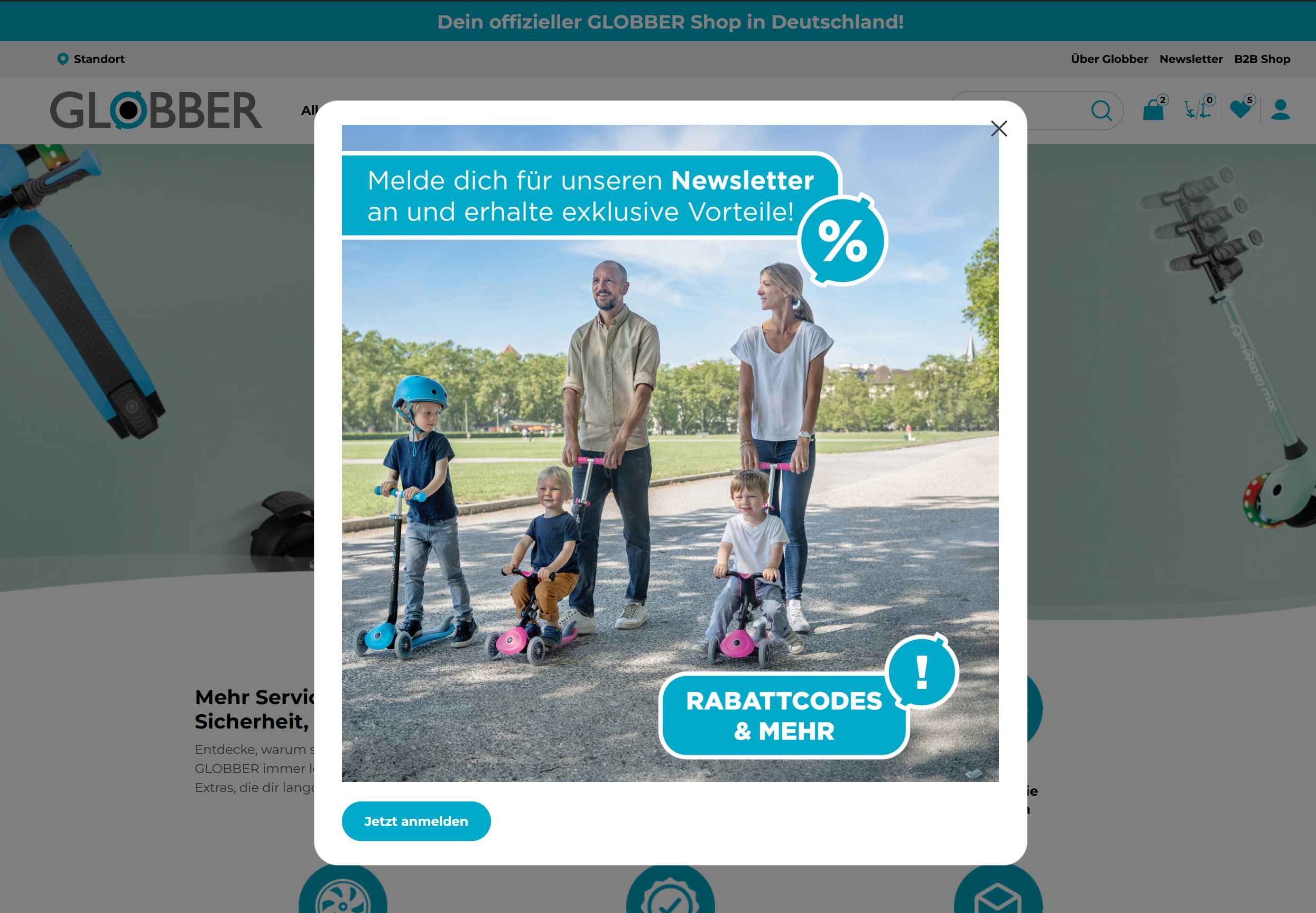
Pop-ups let you do a lot — grab visitor attention, promote offers, collect emails, show announcements, restrict content by audience, and more.
Each pop-up is fully configurable through a set of dedicated settings sections covering everything from display behavior to scheduling and targeting.
How to Create Pop-Up
On WordPress's left-hand side menu, navigate to Pop-up and click Add New Post.

There are 3 main sections to creating a Pop-Up:
- Title — The internal name of the pop-up, used to identify it in the dashboard. Not visible to visitors.
- Body — The visual content of the pop-up built in the WordPress editor. Add text, images, buttons, or any block content you want visitors to see.
- Pop-Up Settings — Controls when, where, and to whom the pop-up appears. Scroll down for a full breakdown of each setting.
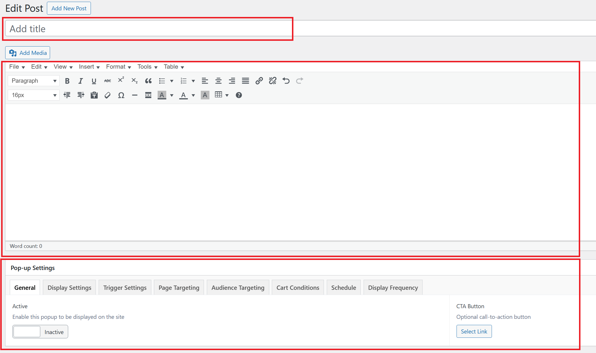
Pop-up Settings
- General
- Display Settings
- Trigger Settings
- Page Targeting
- Audience Targeting
- Cart Conditions
- Schedule
- Display Frequency
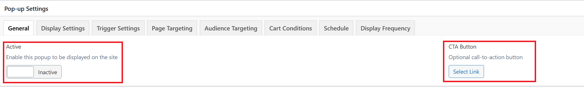
Active
Toggle this on to enable the pop-up on your site. When set to Inactive, the pop-up is saved but hidden from all visitors.
CTA Button
Optionally attach a call-to-action button to the pop-up. Click Select Link to set the URL it points to.
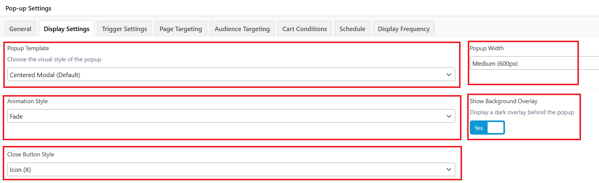
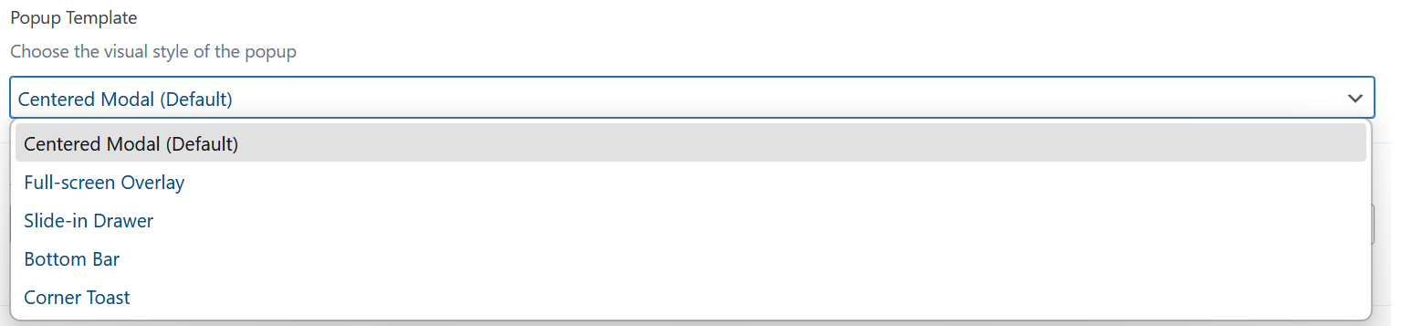
Popup Template
Select the visual style of the pop-up. The following templates are available:
- Centered Modal (Default): A standard pop-up box displayed in the center of the screen.
- Full-screen Overlay: Covers the entire screen, ideal for high-priority messages or promotions.
- Slide-in Drawer: Slides in from the side of the screen for a less intrusive experience.
- Bottom Bar: A fixed bar that appears at the bottom of the page, staying visible as visitors scroll.
- Corner Toast: A small notification-style pop-up that appears in a corner of the screen.
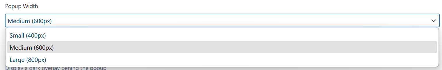
Popup Width
Set the width of the pop-up. Choose from three preset sizes:
- Small (400px): A compact pop-up, ideal for simple messages or quick prompts.
- Medium (600px): The default size, suitable for most use cases.
- Large (800px): A wider pop-up, best for content-heavy layouts or detailed offers.
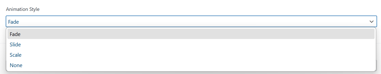
Animation Style
Choose how the pop-up appears when triggered:
- Fade: Smoothly fades the pop-up into view.
- Slide: Slides the pop-up in from a direction.
- Scale: The pop-up scales up from a smaller size into its full size.
- None: The pop-up appears instantly with no animation.
Show Background Overlay
Toggle this on to display a dark overlay behind the pop-up, drawing focus to it and dimming the rest of the page.
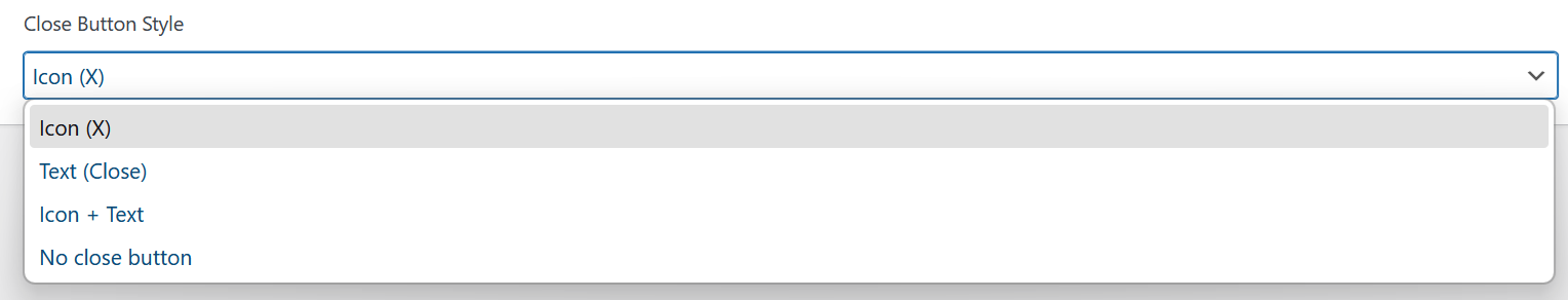
Close Button Style
Select how the close button is displayed on the pop-up:
- Icon (X): Shows a standard X icon in the corner of the pop-up.
- Text (Close): Displays a text "Close" link instead of an icon.
- Icon + Text: Combines both the X icon and "Close" text together.
- No close button: Removes the close button entirely. Visitors must use another action to dismiss the pop-up.

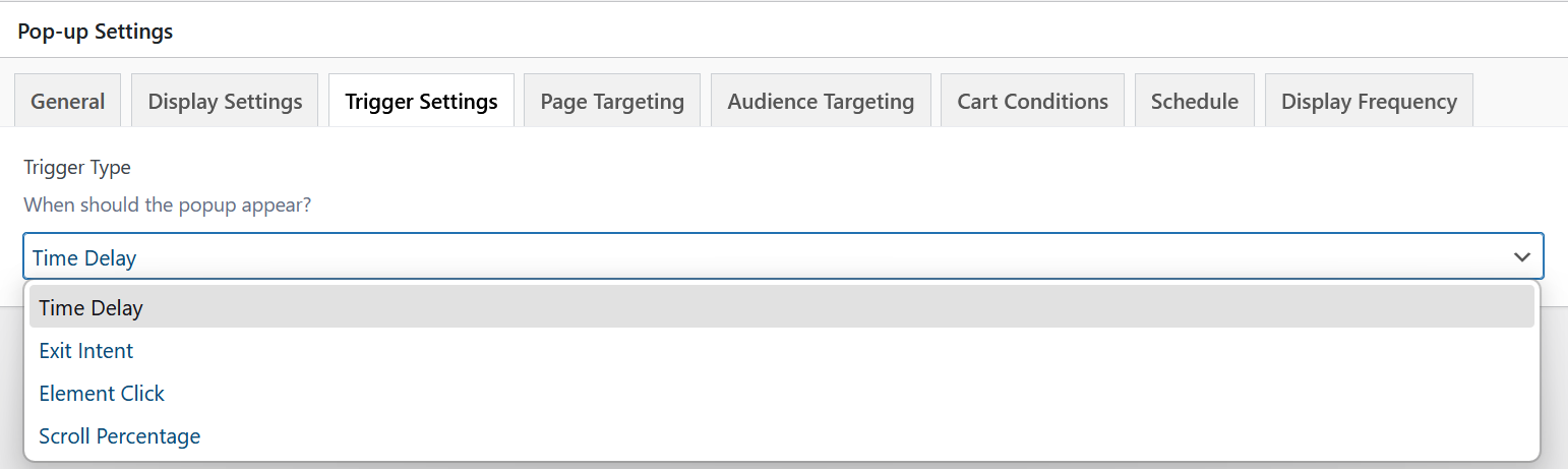
Trigger Type
Choose when the pop-up should appear. The following trigger types are available:
- Time Delay: The pop-up appears automatically after a set number of seconds once the page loads.
- Exit Intent: The pop-up fires when the visitor's cursor moves toward leaving the page (e.g. toward the browser bar or close button).
- Element Click: The pop-up opens when a visitor clicks on a specific element on the page.
- Scroll Percentage: The pop-up is triggered once the visitor has scrolled down a defined percentage of the page.
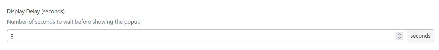
Display Delay (seconds)
When using the Time Delay trigger, set how many seconds to wait after page load before showing the pop-up. Defaults to 3 seconds.
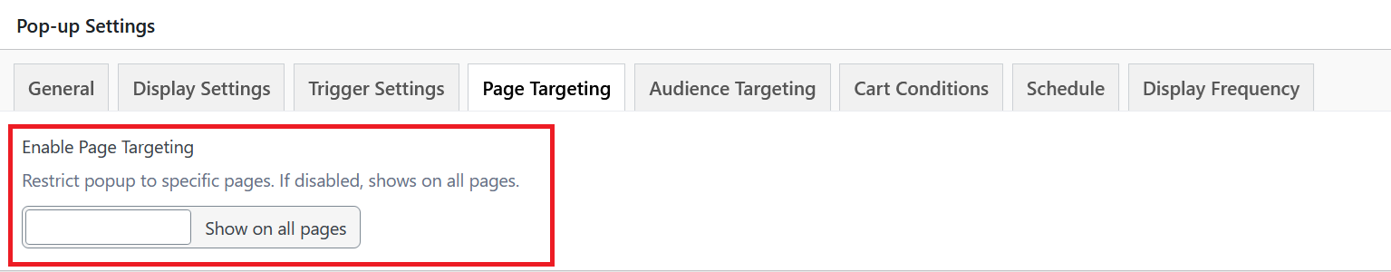
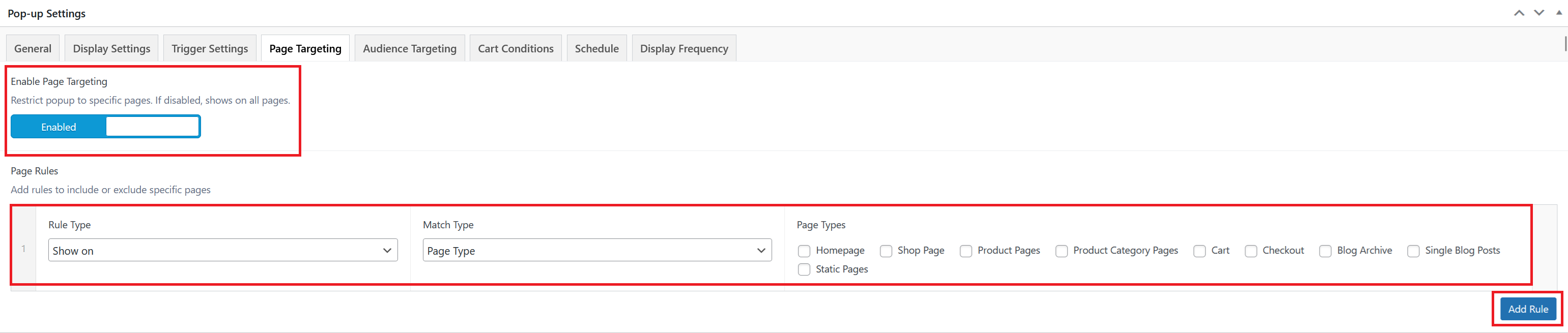
Enable Page Targeting
Toggle this on to restrict the pop-up to specific pages. When disabled, the pop-up shows on all pages site-wide.
Page Rules
When page targeting is enabled, you can add rules to control exactly where the pop-up appears. Each rule has three parts:
- Rule Type: Choose whether to Show on or hide on the matched pages.
- Match Type: Set to Page Type to target pages by their type.
- Page Types: Select one or more page types to apply the rule to. Available options are: Homepage, Shop Page, Product Pages, Product Category Pages, Cart, Checkout, Blog Archive, Single Blog Posts, and Static Pages.
Click Add Rule to add multiple rules and build more specific targeting conditions.
Target Devices
Select which devices the pop-up should appear on. Leave all unchecked to show on all devices. You can check any combination of:
- Desktop
- Tablet
- Mobile

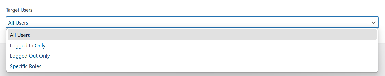
Target Users
Restrict the pop-up to a specific user type:
- All Users: The pop-up is shown to everyone, regardless of login status.
- Logged In Only: Only visitors who are logged in will see the pop-up.
- Logged Out Only: Only visitors who are not logged in will see the pop-up.
- Specific Roles: Limit the pop-up to visitors with a particular WordPress user role.
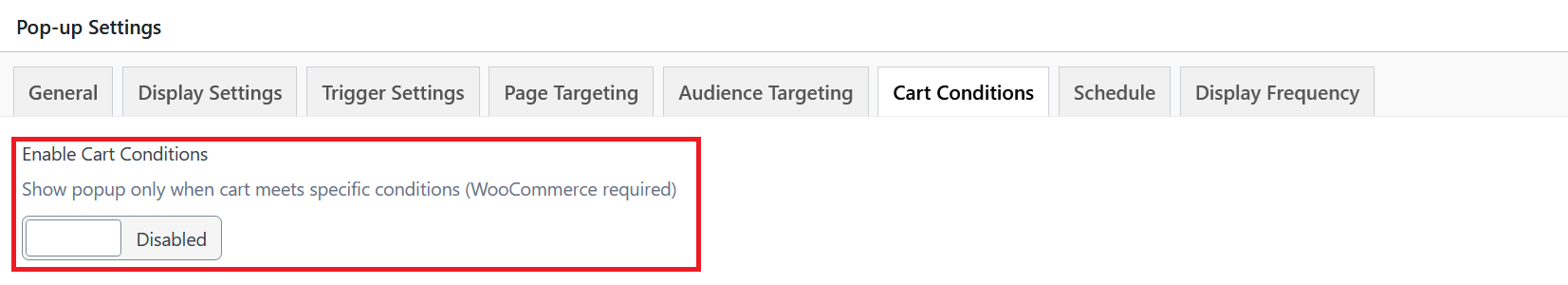
Enable Cart Conditions
Toggle this on to restrict the pop-up to visitors whose cart meets specific conditions. Requires WooCommerce to be installed and active. When disabled, cart state is ignored.
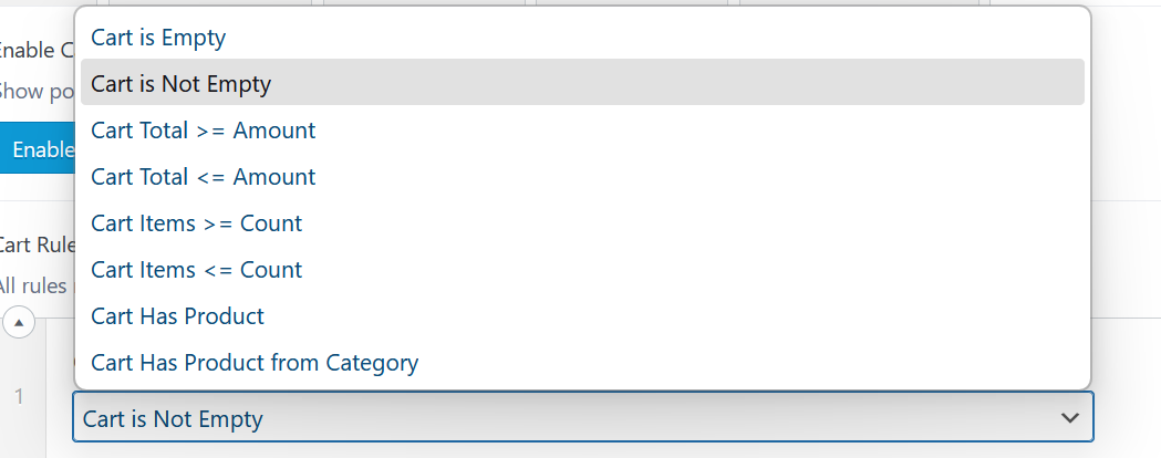
Cart Rules
When enabled, define one or more conditions that must all be met for the pop-up to show. Click Add Condition to stack multiple rules.
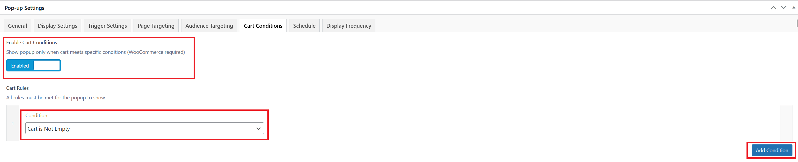
Each rule has a Condition dropdown with the following options:
- Cart is Empty: Shows the pop-up only when the visitor's cart has no items.
- Cart is Not Empty: Shows the pop-up only when the visitor has at least one item in their cart.
- Cart Total >= Amount: Shows the pop-up when the cart total is equal to or greater than a specified amount.
- Cart Total <= Amount: Shows the pop-up when the cart total is equal to or less than a specified amount.
- Cart Items >= Count: Shows the pop-up when the number of items in the cart meets or exceeds a specified count.
- Cart Items <= Count: Shows the pop-up when the number of items in the cart is at or below a specified count.
- Cart Has Product: Shows the pop-up when a specific product is in the cart.
- Cart Has Product from Category: Shows the pop-up when the cart contains a product from a specific category.
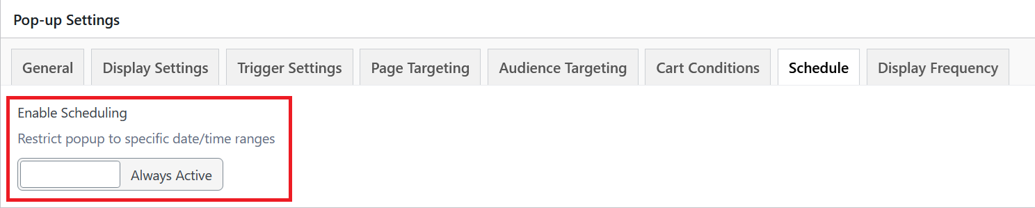
Enable Scheduling
Toggle to restrict the pop-up to specific date/time ranges. When disabled, the pop-up is set to Always Active with no date constraints.
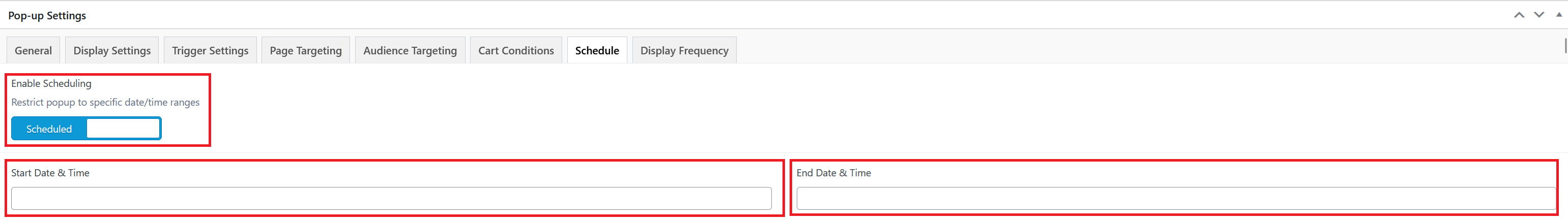
Start Date & Time
The date and time from which the pop-up will begin displaying. Only visible when scheduling is enabled.
End Date & Time
The date and time at which the pop-up will stop displaying. Only visible when scheduling is enabled.

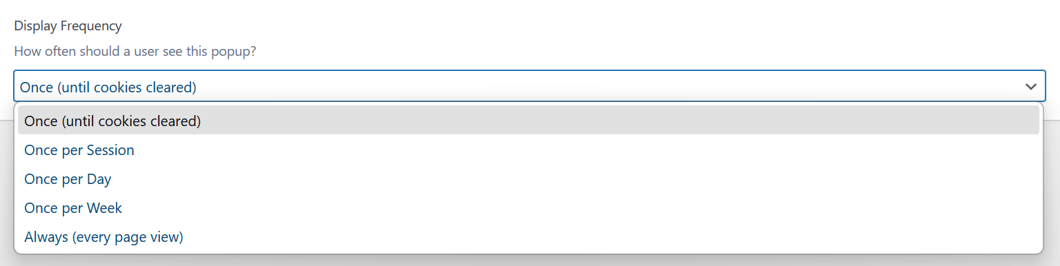
Display Frequency
Controls how often a visitor sees the pop-up. Select from the dropdown:
- Once (until cookies cleared) — Shows the pop-up once and does not display it again until the visitor clears their browser cookies.
- Once per Session — Shows the pop-up once per browser session.
- Once per Day — Shows the pop-up no more than once every 24 hours.
- Once per Week — Shows the pop-up no more than once every 7 days.
- Always (every page view) — Shows the pop-up on every page load that meets the trigger and targeting conditions.
Custom Cookie Expiry (days)
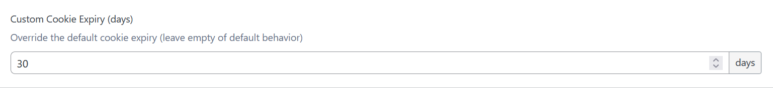
Override the default cookie expiry period. Leave empty to use the default behavior. Defaults to 30 days.
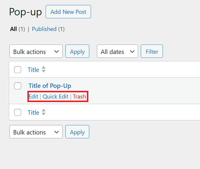
Managing Pop-Ups
On WordPress's left-hand side menu, navigate to Pop-up and click Pop-up.

Hover over any pop-up title to reveal the row actions:
- Edit — Open the full editor to update the pop-up's content or settings.
- Quick Edit — Inline-edit the pop-up's title or status without leaving the list.
- Trash — Move the pop-up to the trash to delete it.